

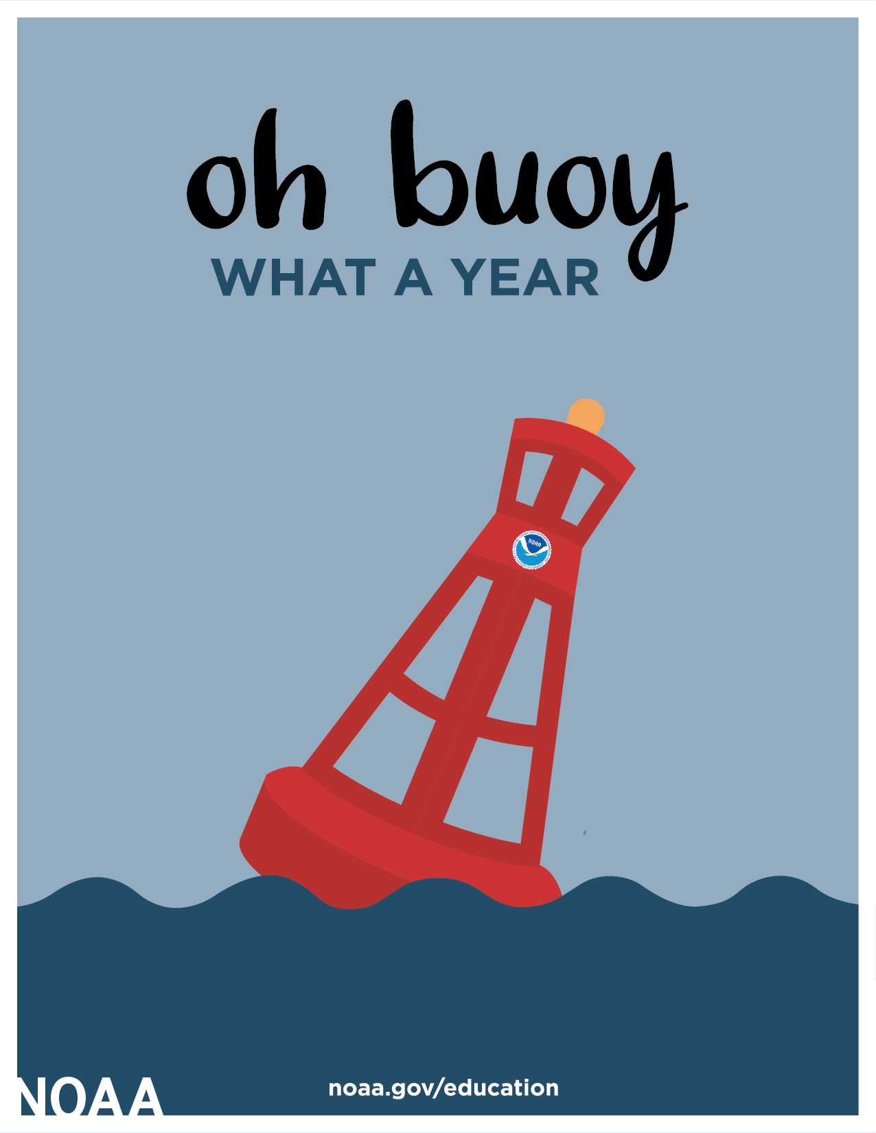
"Oh buoy what a year!"
"Oh buoy what a year!"
And an exciting new tool from the National Oceanic and Atmospheric Administration.

2022 is just days away! Admittedly, I’m not much of a holiday person, but I do generally enjoy celebrating the end of the year. Perhaps it’s my coastal New England roots, but I thought this holiday card from the National Oceanic and Atmospheric Administration (NOAA - Department of Commerce) was appropriate for the end of 2021 (check here for the other options):
Why was NOAA on my mind this week? Well, simply put: the weather outside is frightful!
In Civics this Week: Severe Weather and Natural Hazards
Severe weather is a part of our lives most everywhere we go. Home for the holidays in Maine with my parents, I am reminded of the real dangers faced by individuals and communities unprepared for snow storms and freezing temperatures. In the Midwest, where I’ve lived for several years now, many of us experienced a distressing night on December 10th when tornadoes devastated numerous communities across the region. I was lucky that my city only experienced thunderstorms and wind, but several communities across widespread areas, such as western Kentucky, were hit with devastating losses of life, property, shelter, and security that may take years to recover from (see the satellite image below from NOAA of the storms).

I wanted to highlight these events this week because the end of 2021 looks drastically different for the survivors of those storms. Throughout the hustle and bustle of regular holiday and end-of-year seasons, not to mention the stress of navigating further pandemic complications from the Omicron variant, it is easy to forget about recent climate disasters in other parts of the country and the long lasting impacts they’ve brought.
If you want to stay updated on federal disaster recover efforts in these communities, follow FEMA press releases here. A recent FEMA blog post issued the important reminder that “recovery lasts much longer than media attention” and provided a list of ways that individuals, organizations, and private sector partners can provide support. If you’re concerned about severe weather in your area, The National Weather Service’s (NWS) Storm Prediction Center is a good resource to look at regularly. 1
What do storms have to do with government information access? Whether we like it or not, severe weather events and climate disasters are a part of our future just as they are a part of our past. Often without realizing it, we already think about the impact of the weather on our near futures when we check the forecast daily and thus come into contact with NOAA data, which is the initial information source used by public and private weather channels to translate the forecast to the public. For an interesting explanation of how NOAA data informs the forecasts for each of our preferred weather channels, watch this 2-minute video from NOAA:
Of course, weather forecasts are only accurate up to a certain point and don’t necessarily give you a clear overview of your current or projected vulnerability to larger climate hazards. What NOAA data can individuals use to understand these risks and make informed decisions about their future, such as where to live, where and when to travel, or even what kind of insurance to shop for? What kind of research can communities do to help out their most vulnerable?
Well, that leads me to the deep dive for this week into an exciting new civic tool!
NOAA’s New Mapping Tool
Recently, the National Oceanic and Atmospheric Administration (NOAA, Department of Commerce) debuted a mapping tool developed by their National Centers for Environmental Information (NCIE) along with FEMA and a few other institutions. The mapping tool can be accessed through NOAA’s Billion-Dollar Weather and Climate Disasters website, which tracks weather and climate disasters in the United States each year that result in damages and costs of at least $1 billion. According to the summary data in the Overview section, there were 22 events of this nature in 2020 that resulted in 262 deaths and a total loss of $100.2 billion for costs and damages.2 The mapping tool, now accessible under the Disaster and Risk Mapping section, provides data visualizations for state and county risk scores.3
The mapping tool builds off of some other resources you may be familiar with, including FEMA’s National Risk Index (NRI) and the CDC/ATSDR Social Vulnerability Index (SoVI), which help users understand the natural hazard risks their local communities face as well as their capacity to respond to these risks. In sum, the tool uses data on natural risks as well as data on socioeconomic variables to develop hazard risk scores. The “Historic and Future Risks” section under the mapping tool provides more detail on the data used, what kinds of conclusions can be drawn from it, purposes it can be used for, and its limitations. It’s a great section for those looking to understand this data in further depth.
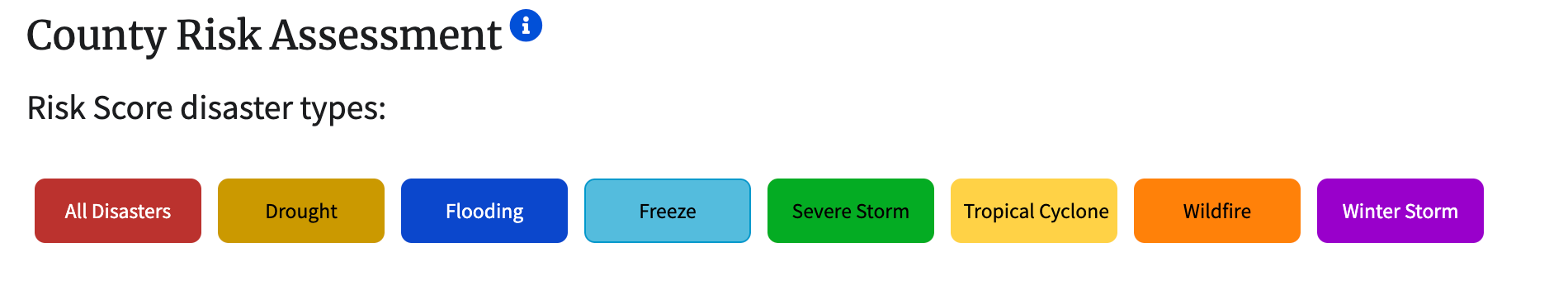
One of the notable aspects of this mapping tool is that it makes it possible to identify current and future risks from natural disasters at a county level (scroll down to the “County Risk Assessment” section), which significantly increases our ability to contextualize the situation of local communities within state and national data. While the website does note that “users with access to local data for each risk component should consider substituting those data to calculate a more precise annual loss values at the local levels”, it is still a useful resource to easily compare data between counties. It also is a great baseline to begin your research with, especially if you are having trouble accessing local data. You can search for risk scores for all disasters, or you can create visuals that represent scores for combinations of different disasters, such as droughts and wildfires or flooding and winter storms. If you want to learn more about how to use it, try watching this Tiny Tutorial from NOAA.
Let’s try an example! Here is a scenario: let’s say I want to move from Kern County, CA to Palm Beach County, FL, and I want to get the risk scores for both counties.4 Since I’m thinking about moving to the other side of the country, I want to obtain a comprehensive overview of all disaster risks in Palm Beach County, rather than just one or two that I think I might encounter. I’ll first make sure that all disaster types are selected, which looks like this:
I’ll also set the slider variables (below the risk score types):
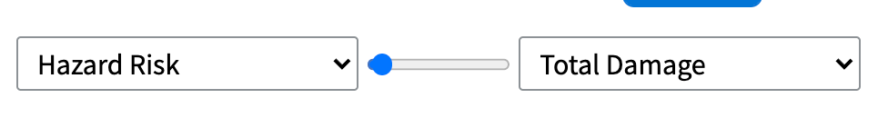
This part is a little clunky, but if you click on the dropdown arrows for each end of the slider, you can see that there are categories under historic and future risks. “Hazard risk” is a historic risk category and “Total Damage” is a future risk category that represents the % County GDP implicated by the risk of future billion-dollar weather events. This setup will allow me to compare past hazard risks with anticipated future impact, but you could make other selections from the dropdown menu to compare (such as SoVI scores).
Then, I’ll move my cursor to the map below, which will be color coded in different shades of red (if you select just one disaster, the map will appear in the corresponding color to the button). Hovering my cursor over Palm Beach County will reveal a comparison of the hazard risk and total damage scores for the U.S. the state of Florida, and Palm Beach County in question. I can also take a look at the entire country broken up into county scores, taking note of how many others have a similar looking hazard risk score to mine (see the risk score key in the bottom right corner).

Using the slider tool at the top left, I can transition to a view of the total damage scores, still with the same score comparison at the bottom. Finally, I’ll then actually click on Palm Beach County to get historic and future risk assessments for this county broken down by disaster type. I’ll also do the same for Kern County. Here’s what I get:
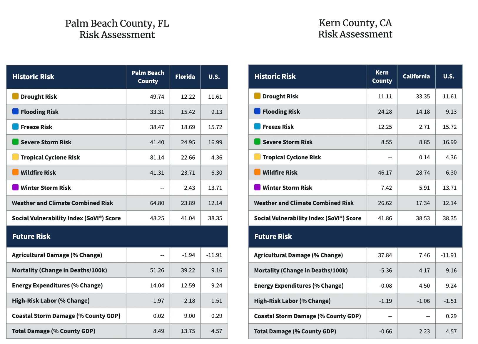
Like the map, the historic risk assessment compares the county scores to state and national scores for extra context. In addition to total damage (represented by % county GDP), the future risk assessment reports a few different projections such as changes in mortality or in the percent change in energy expenditures (the future risk category is based on county-level median values for 2080-2099 scenarios. Read the “Historic and Future Risks” section under the mapping tool for detailed information on these values and why they were selected). In some categories, scores and projections are not available.
Considering my potential move from Kern County to Palm Beach County, I would probably further investigate into the higher historic drought and tropical cyclone risks in Palm Beach County, which took me by surprise. I might also note the substantial increase in the weather and climate combined risk score in Palm Beach paired with a slightly lower SoVI score. To take the investigation one step further, I could return to the map visual and take a look at surrounding counties in the Palm Beach area and see how those historic and future risks compare. If I’m really starting to feel serious about the move, my next project would be to try and access local data for these counties.
In Conclusion
This map tool is new and will probably see future developments - after your initial exploration, consider checking back in the next few months to see if it has changed or evolved in any way.
I used the example of moving, but other reasons one might be interested in these county assessments could have to do with concerns regarding emergency planning, farming opportunities, employment, real estate, or simply general interest.
If this mapping tool intrigues you, I encourage you to try representing your own scenarios with it. Try putting in your own county - what results do you get? Does any of it surprise you? Let me know what you learn or any thoughts about the mapping tool in the comments!
See you next week!
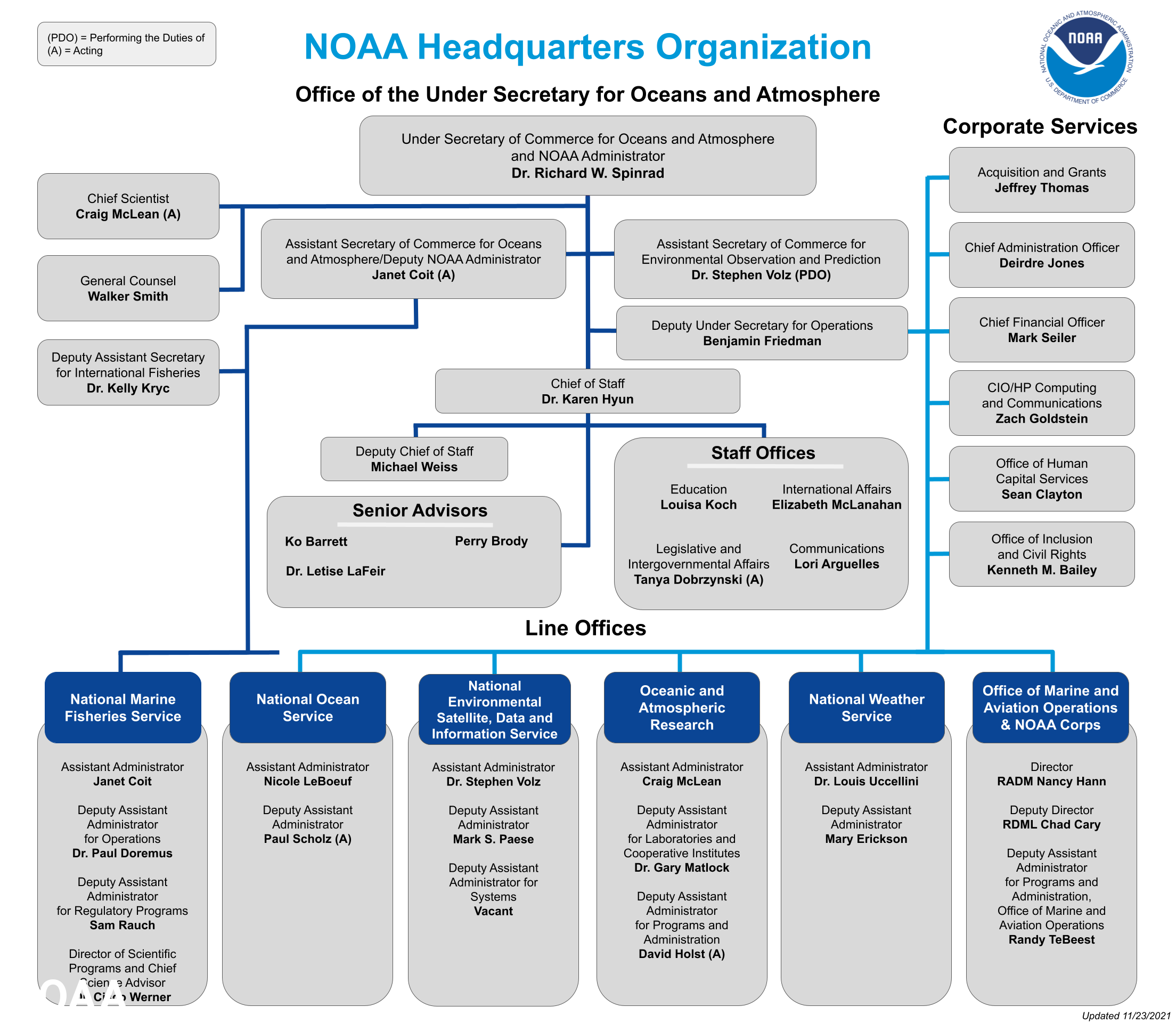
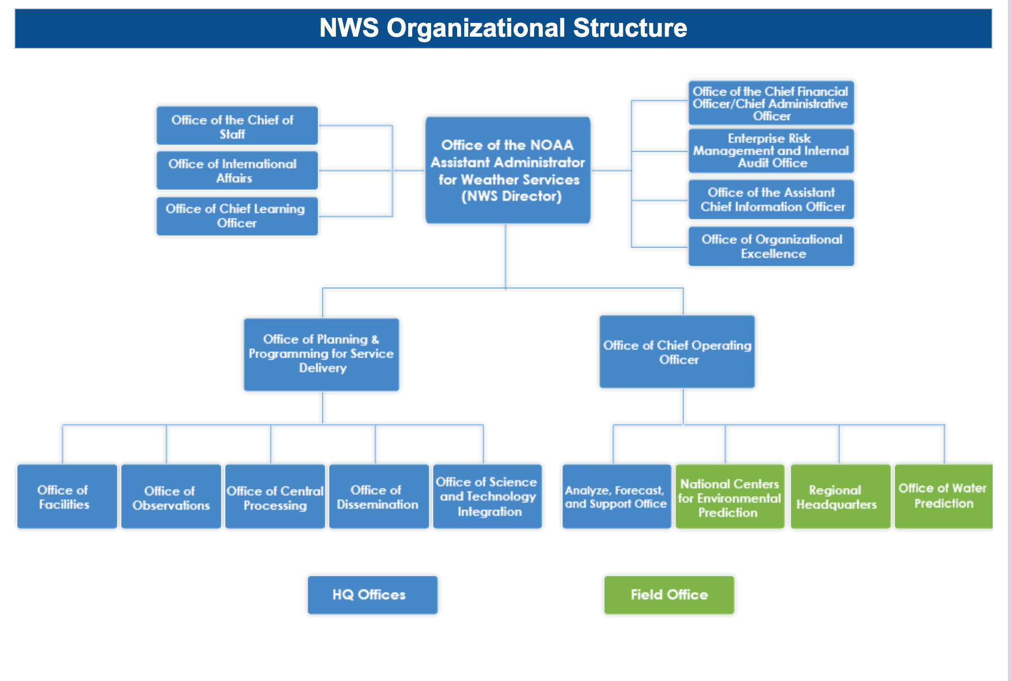
The Storm Prediction Center is a sub-center within the National Centers for Environmental Prediction (NCEP), which is a sub-organization of the NWS. The NWS is an office within NOAA. See NOAA’s and NWS’s organizational charts below for more information (accessed December 22, 2021).
NOAA National Centers for Environmental Information (NCEI) U.S. Billion-Dollar Weather and Climate Disasters (2021). https://www.ncdc.noaa.gov/billions/, DOI: 10.25921/stkw-7w73.
For more news coverage about this mapping tool, check out this article from GCN or this blog post from the National Association of Counties (NaCo).
I purposefully picked two counties that were very far away from one another, but no further considerations informed their selections - once I had the general area pinned down, I just selected at random.